Freelance works
A collection of freelance projects for small brands and cafes, each built around clear concepts, visual storytelling, and personality. From mascots to packaging, these works highlight how thoughtful design can capture warmth, humor, and identity in simple forms.
HAUSMATES IMPROV GROUP
2025
Tools: ProCreate, Adobe Illustrator
Deliverables: Group mascot/logo, posters
THE BRIEF
The client wanted their cafe menu redesigned with a simple, clean, line-art style but still full of personality. The goal was to keep it grounded in their existing brown-and-cream palette while adding a hand-drawn, doodle-inspired touch that reflects the cafe’s Scandi interiors and chill atmosphere.
THE PROCESS
Reviewed their existing menu layout and identified what needed improvment
Developed a new visual direction centered on line art and warm neutrals
Created hand-drawn doodles to add character without overwhelming the layout
Balanced typography and spacing for easier readability
Finalized the design in print and digital formats for in-store and social media use
THE OUTCOME
The redesigned menu feels fresh yet familiar. Clean and minimal in the necessary areas, but with much more personality in the front menu with doodles that showcase what the cafe has to offer.
-
![]()
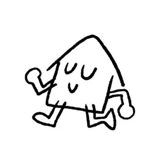
Initial concept
This was initially a doodle drawn in passing but upon the group seeing it, they felt it was “very us”.
-
![]()
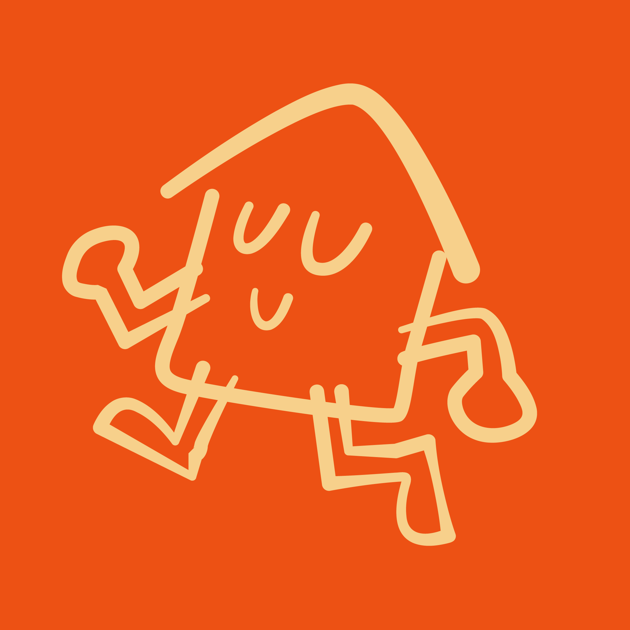
Final logo & mascot
Keeping the colors warm and orange was a no-brainer as it felt very connected to the energy and fire that the Hausmates gave. The group decided to name the mascot “Hau-Hau”.
-
![]()
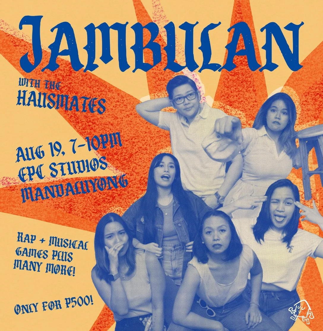
Jam poster
A poster inviting fellow improvisers to play with the Hausmates. This was released for the Third World Improv community, the improv community which the Hausmates graduated from.
-
![]()
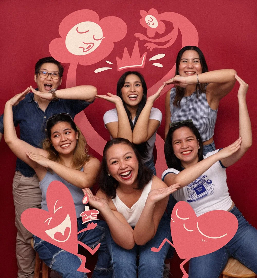
social media post
Doodled an image for a birthday social media post for one of our own.
-
![]()
show poster
A poster for our show ‘Nugagawen?’ where the theme of the show was all about not knowing what to do next but winging it anyway.
-
![]()
show poster
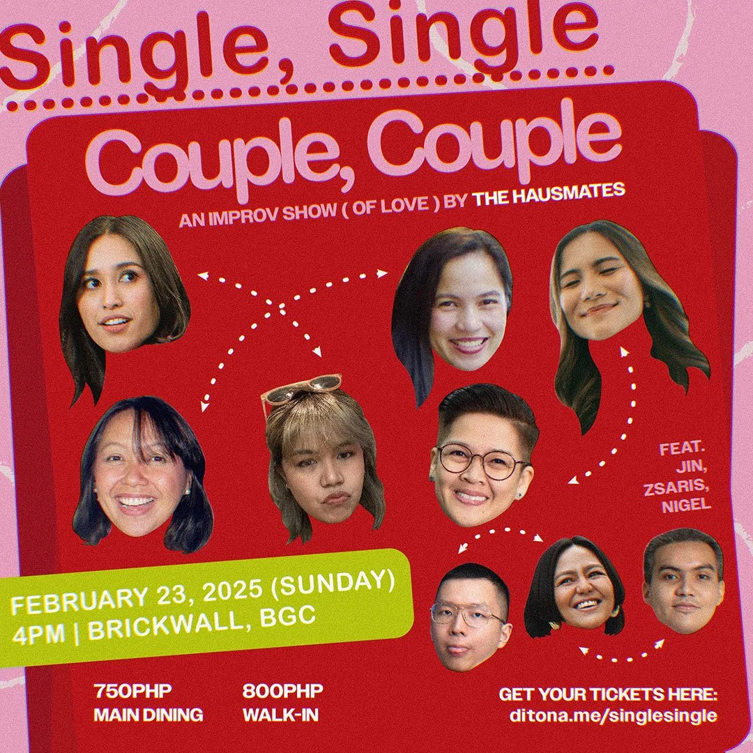
Our February show poster for the month of love. ‘Single, Single, Couple, Couple’ was all about being playful in all matters of the heart.
-
![]()
show poster
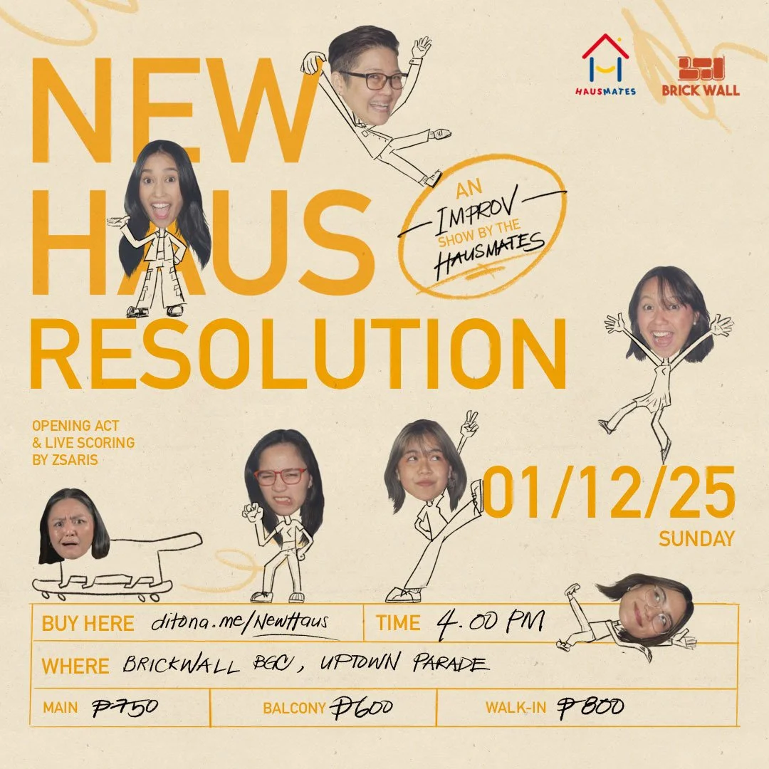
This show poster marked Hausmates’ debut as an improv group after graduating from The Third World Improv. Titled ‘New Haus Resolution,’ it introduced us with a clean-slate feel — stripped down, honest, and a little chaotic in the best way.

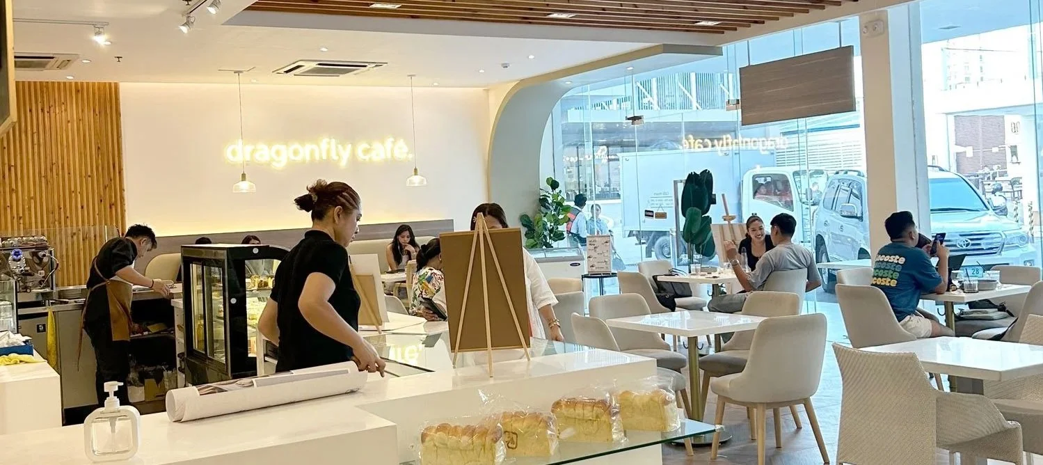
DRAGONFLY CAFE
2025
Tools: ProCreate, Adobe Illustrator
Deliverables: Menu Design
THE BRIEF
The client wanted their cafe menu redesigned with a simple, clean, line-art style but still full of personality. The goal was to keep it grounded in their existing brown-and-cream palette while adding a hand-drawn, doodle-inspired touch that reflects the cafe’s Scandi interiors and chill atmosphere.
THE PROCESS
Reviewed their existing menu layout and identified what needed improvment
Developed a new visual direction centered on line art and warm neutrals
Created hand-drawn doodles to add character without overwhelming the layout
Balanced typography and spacing for easier readability
Finalized the design in print and digital formats for in-store and social media use
THE OUTCOME
The redesigned menu feels fresh yet familiar. Clean and minimal in the necessary areas, but with much more personality in the front menu with doodles that showcase what the cafe has to offer.
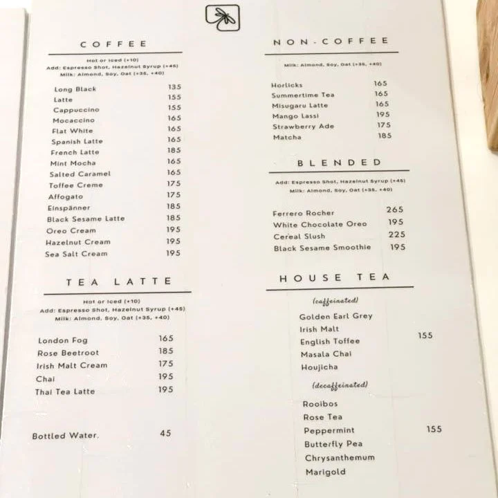
Old Menu
Actual
Revamped menu
Kamyas Coffee
2023
Tools: ProCreate, Adobe Illustrator
Deliverables: brand mascot
THE PROCESS
Conducted a short discovery session to understand the cafe’s personality and story
Explored mood directions referencing minimalist Korean and Japanese cafés
Developed three mascot concepts, each with a different tone: cozy, whimsical, but minimalist
Narrowed down to a cat mascot to show homage to the owner’s beloved pet cats
Refined the design to match the brand’s soft, homey aesthetic
THE BRIEF
The brief was to design a minimalist mascot with quirky cafe character vibes inspired by Korean and Japanese aesthetics. The client wanted something that felt homey and nostalgic, tying back to their cafe’s unique setting which is a cozy space built from their family’s ancestral home.
THE OUTCOME
The final cat mascot with a house for headgear became Kamyas’ little ambassador. A simple, cheerful character that captures what the space feels like: familiar, warm, and made with heart.
1 of the 3 initial concepts
Final design of the brand mascot
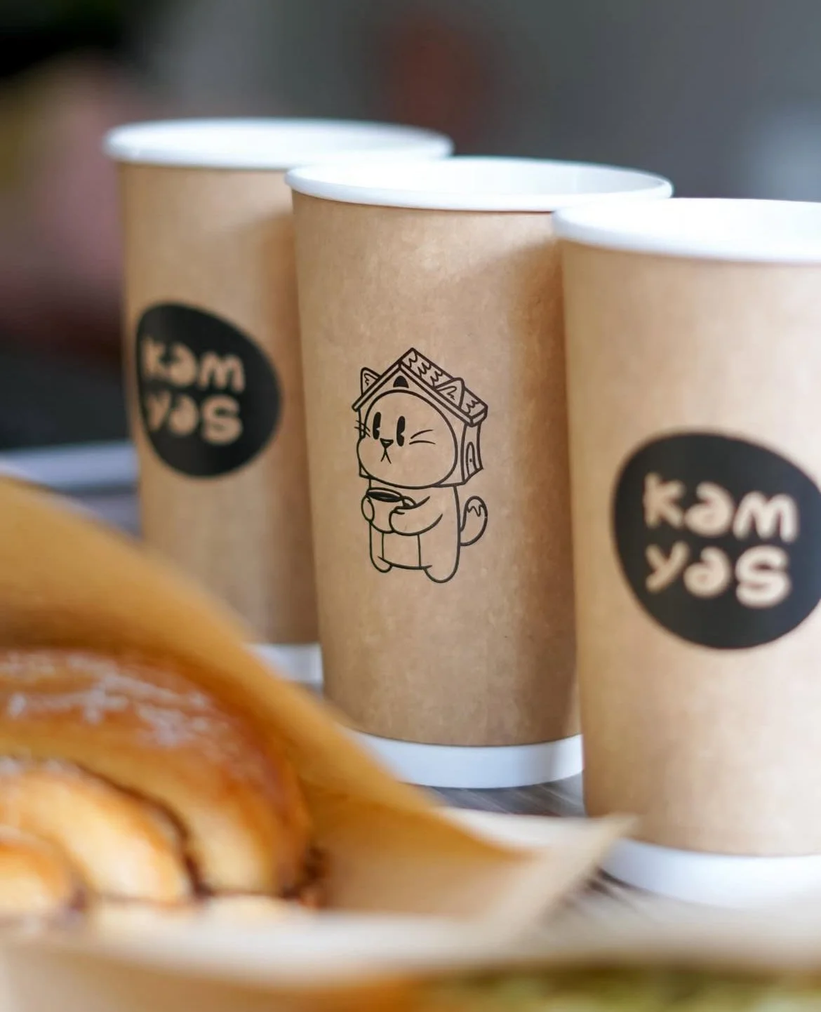
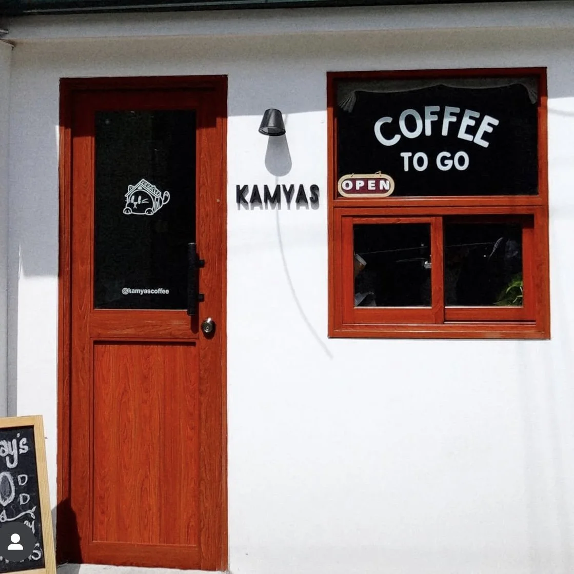
The mascot on the coffee cups & cafe’s front door
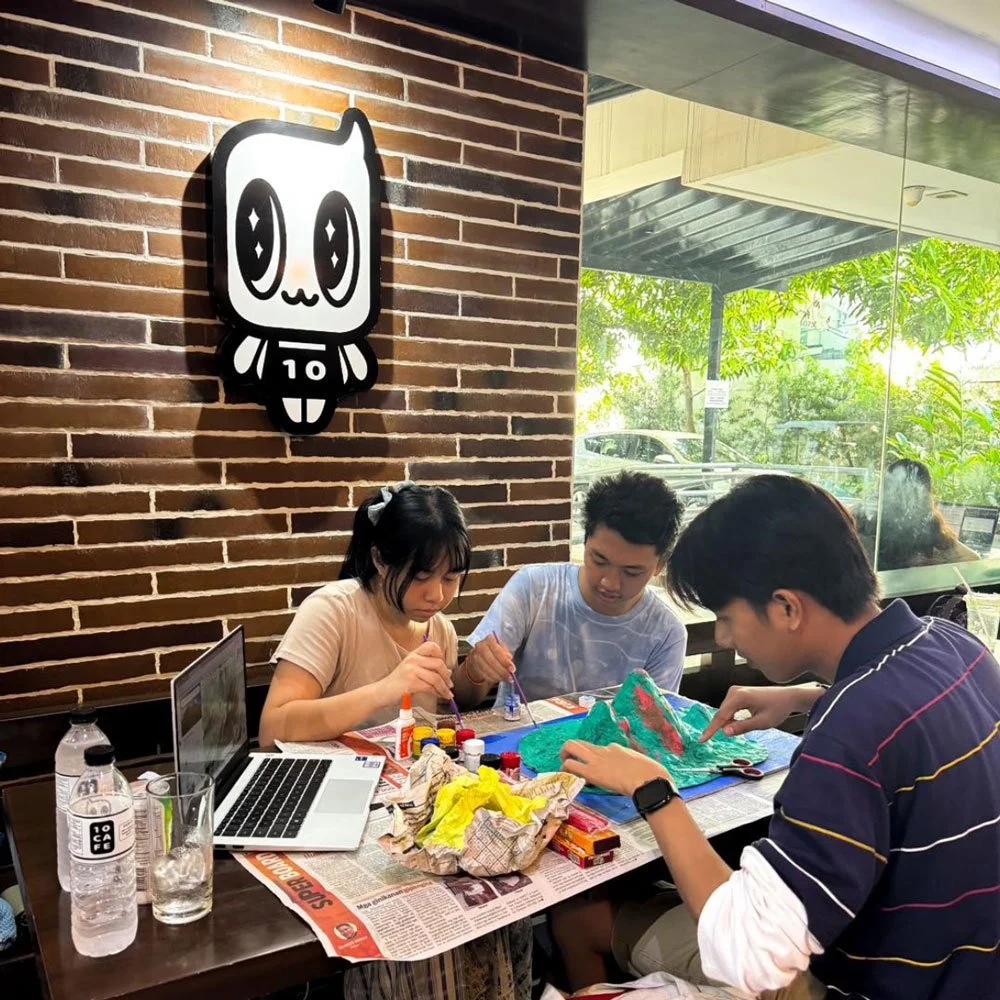
10cafe
2021
Tools: Adobe Illustrator
Deliverables: brand mascot, social media
assets & animation
THE PROCESS
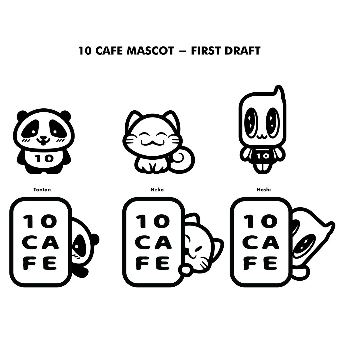
Explored several character directions focused on simplicity and charm
Created three distinct mascot concepts, each with a different personality and shape language
One concept, a small, alien-like character stood out for its odd yet endearing energy
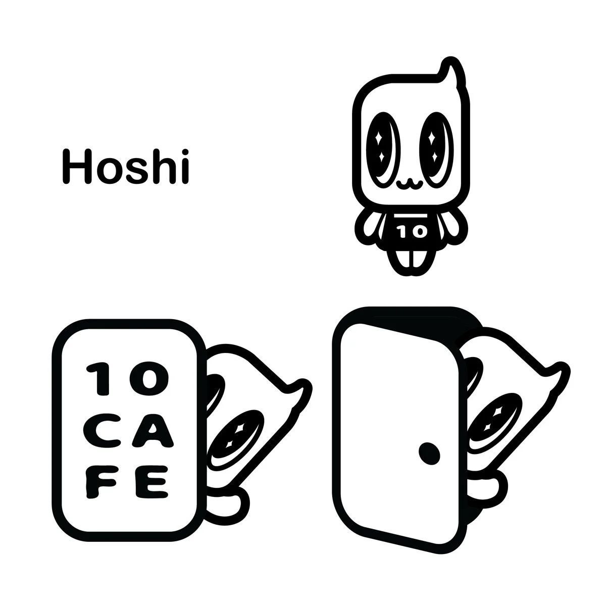
Finalized and named the character Hoshi, inspired by the Japanese word for “star,” to capture its curious and whimsical nature
Delivered clean vector assets and style references for future brand use
THE BRIEF
The client wanted a simple, black-and-white mascot that was minimalist, cute, and unique. They also gave me full creative freedom to interpret what that could look like.
THE OUTCOME
Hoshi became the cafe’s official mascot. A minimalist little alien with just the right mix of cute and weird that perfectly matched the cafe’s understated but playful brand personality.
-
![]()
initial concepts
Different mascot concepts
-
![]()
final mascot
The name Hoshi came from the starry-eyes the character had.
Property of 10Cafe. For portfolio purposes only.
-
![]()
hoshi signage at the cafe
Image from @10cafecebu
-
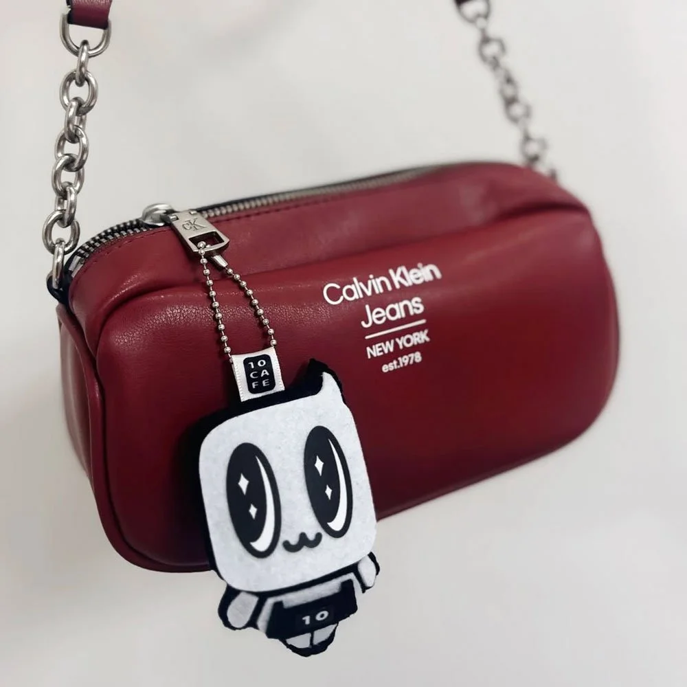
![]()
limited Hoshi bag charm
Image from @10cafecebu
-
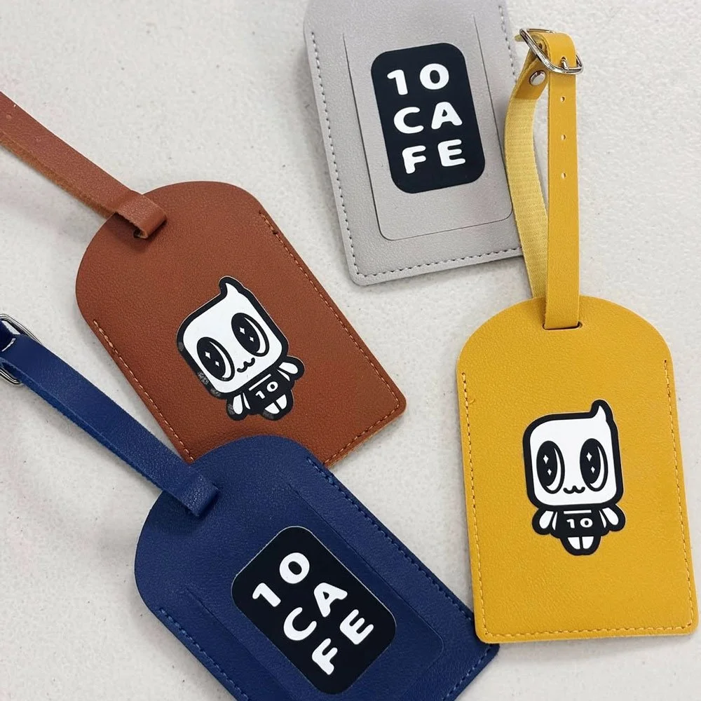
![]()
cafe merch ft. hoshi
Image from @10cafecebu
blue al inc
2021
Tools: Adobe Illustrator
Deliverables: product packaging design
THE BRIEF
The client wanted a set of three hand sanitizer packaging designs to be sold in retail stores like Watsons. Each variant needed to capture a specific uplifting theme, something that felt comforting and optimistic during the height of the pandemic. The packaging had to be feminine, eye-catching, and suited for small compact bottles.
THE PROCESS
Worked from the client’s provided concepts and visual references
Together with the client, we developed the concepts further, each reflecting a different emotional tone
Bright Future Hero: inspired by tarot and crystal ball imagery, symbolizing hope and optimism
Comfort Within: centered on calm hobbies and cozy routines — plants, yoga, rest, and small joys
Love Yourself: focused on self-love and authenticity, featuring motivational quotes and soft, reassuring visuals
Designed for both shelf appeal and emotional connection where we turned everyday sanitizers into small reminders of care
THE OUTCOME
The final packaging set brought warmth and positivity to a practical product. Each design carried its own story while feeling part of one uplifting series. It was proof that even hand sanitizers can spark a bit of comfort in uncertain times.